

Hayley Cakes and Cookies:
CASE STUDY
Summary
~
Summary ~
Client:
Hayley Cakes and Cookies
Year:
2024
Haley Cakes & Cookies' website is restricted with an outdated design, excessive pages, and poor navigation, creating a fragmented user experience. Customers face difficulty exploring products, placing orders seamlessly, and effectively connecting with the brand, leading to increased frustration and poor customer satisfaction. Additionally, these issues negatively impact SEO performance, ultimately causing lost sales and diminished brand loyalty.
Intro:

Welcome to the redesigned digital experience for Haley Cakes & Cookies! Recognizing the recipe for confusion that comes with an outdated website filled with too many pages and tricky navigation, we've baked in an intuitive, user-friendly redesign. The updated layout ensures smooth browsing, simplified ordering, and clear brand communication. Our streamlined approach is crafted to boost customer satisfaction, enhance SEO performance, and sweeten every sales opportunity.


The Research:
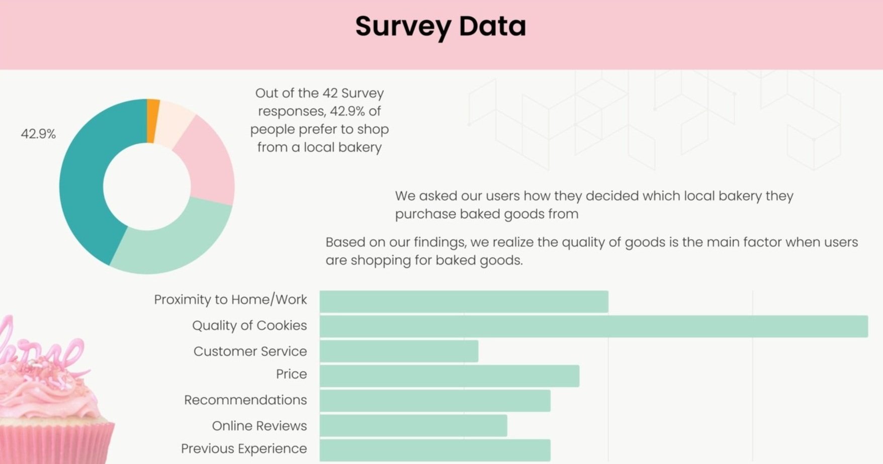
Research: We dove deep into user research through website navigation interviews, sat down with Hayley to uncover her brand story and vision, and immersed ourselves in all three Austin locations to capture the authentic bakery experience.
User Insight statement: Users are overwhelmed by the confusing and cumbersome process of ordering baked goods online, this negative experience can lead to unsatisfied customers and incomplete checkouts. Users need a simple checkout experience that allows them to customize their orders so that they feel confident they made the best choice and will be repeat customers.
Heuristic evaluation: We conducted a heuristic evaluation of Haley Cakes & Cookies' original website, assessing usability issues based on Nielsen’s heuristics. The key findings included poor navigation, excessive and redundant pages causing confusion, outdated design impacting aesthetics and trust, limited user control, and inconsistencies hindering seamless user experiences. These usability shortcomings resulted in difficulty locating products, cumbersome ordering processes, and reduced overall customer satisfaction. This evaluation provided clear direction for targeted improvements in our redesign strategy.
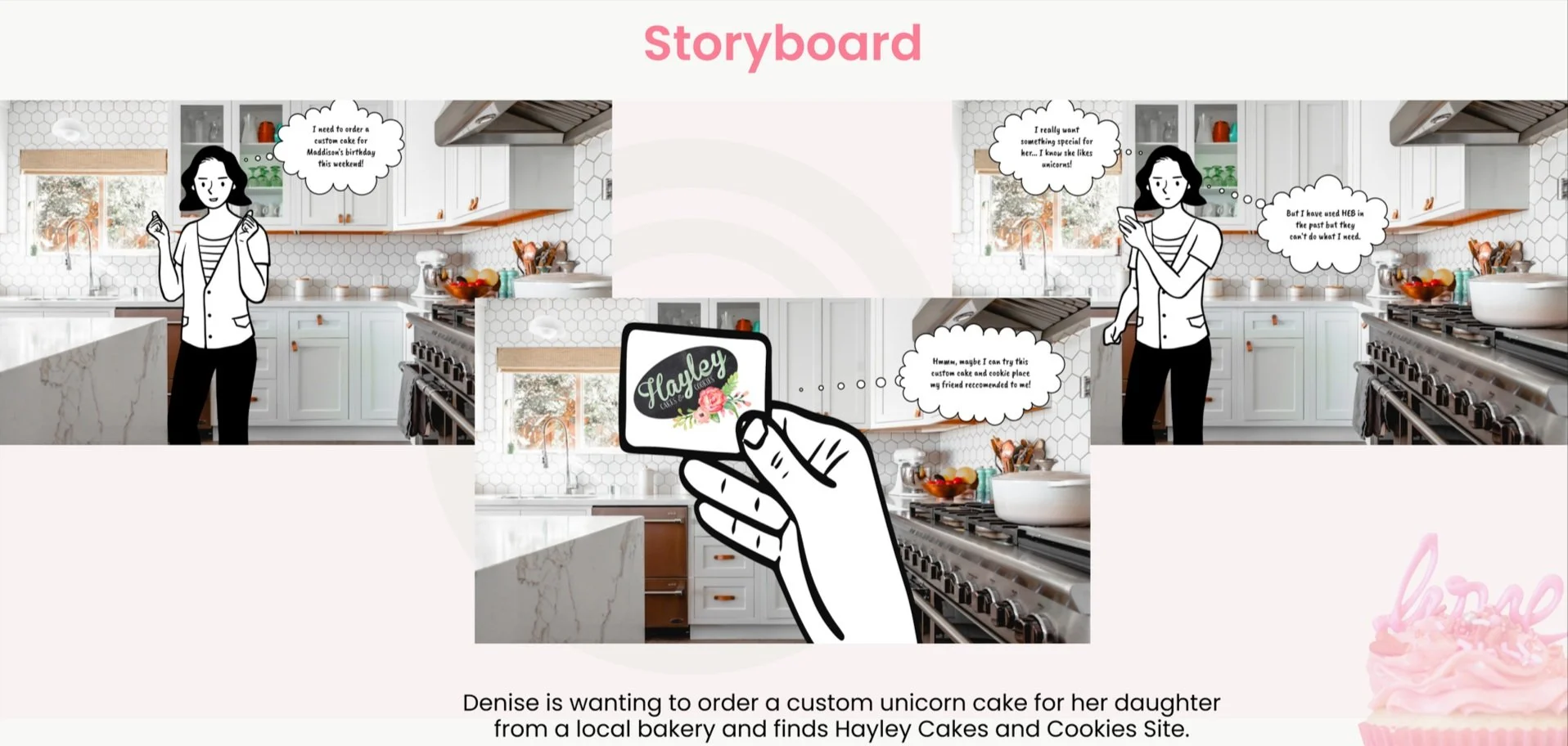
Storyboard: We created a storyboard to visualize the full customer journey—from browsing to order completion. This helped align the team on key user needs, emotional touchpoints, and potential friction in the experience. It served as a strategic tool to guide design decisions, prioritize features, and ensure a seamless, user-centered ordering process that supports business goals.


